Hule
About Project
As the Senior product designer, I solved the key usability issues and revamped the visual style by re-imagining what it’s like for WellDyne's users to manage member account. The new design reduced task times by 68% and improved users’ subjective satisfaction by 139%.
Duration
10 Sprints
My Role
UX Designer
Tools Used
Figma, Zeplin, illustrator, Photoshop
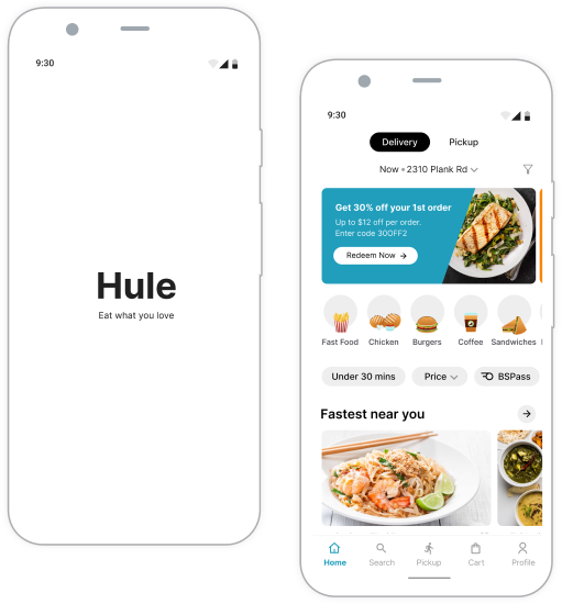
HuleApp
As the Solo product designer, I revamped the visual style by re-imagining what it’s like for Hule mobile app’s users to order food from multiple restaurants. I also worked on big picture storyboard, closeup storyboard, competitive analysis, user research, prototype, animation, graphics and visual design, User testing.
Duration
4 Sprints
My Role
UX Designer
Tools Used
Figma, Zeplin, illustrator,
Photoshop
Background Hule food delivery app helps users to build food delivery experiences for their food delivery service with our comprehensive new feature “A order from Multi-restaurants”. Our competitive advantage over the competitors such as UberEats and Doordash is the ability to empower users to talk in an unconstrained way.
Problem Space Individuals and professionals who desire a taste of various cultures’ cuisines face difficulties when attempting to place multiple food orders using our Hule app. This limitation hinders a seamless and diverse food ordering experience.
user
Problems
- Limited Food Diversity Experience
- Users encounter a challenge in experiencing a diverse range of food options from various cultures due to constraints in the app that make it difficult to place multiple food orders seamlessly.
- Inefficient Ordering Process
- The current app setup makes it cumbersome for individuals and professionals to place multiple food orders, creating an inefficient and time-consuming ordering experience.
- Reduced User Satisfaction
- The struggle involved in placing multiple food orders affects the overall user satisfaction, potentially resulting in a decline in user engagement and usage of the Hule app.
- Customer Retention and Attraction
- The existing limitation may discourage potential users from adopting the Hule app and could lead to a drop in customer retention rates as users seek more convenient alternatives to fulfill their desire for diverse food tastes.
Research I want to understand common challenges people face trying to manage a busy schedule and meal planning for different food preference people.
I took user survey and user interviews to identify frustrations people experience during the process of ordering from multiple restaurants for the event, or their needs.
Unmoderated
User Survey
8 Responses from working professionals
Objective: to collect quantitative data about the interest of application and complete the order process.
Moderated
User Interviews
2 Working professionals
Objective: to find out what part from the application get frustrated user to read and guide.
participant
characteristics
Ages 18-50
Lives in metropolitan or suburban areas
People who order food from restaurants at least once a week
Include participants of different genders
Include participants with different abilities
Interview
questions
Interviewing
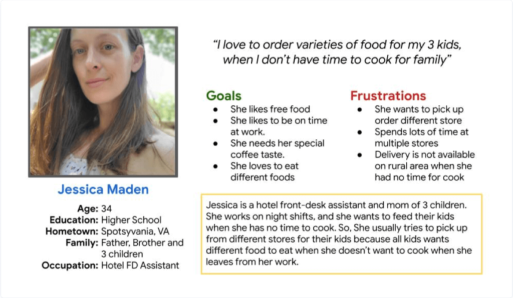
Two Key Personas for Insights
For every identified segment, I began to breathe life into the personas. With names, ages, backgrounds, and personalities, these personas turned into relatable, semi-fictional characters representing the essence of their respective user segments.
User personas explored ways to communicate to give clear user pain points, opportunity, goal information.
User Stories I actively engaged with users through moderated sessions to extract invaluable user stories. These interactions provided deep insights, enriching our understanding of user needs and informing our product development strategies.
Visualize
the User’s Path
Through meticulous analysis and empathetic engagement, I crafted a detailed user journey map. This map visually encapsulates the user’s experience, illuminating their path and guiding product enhancements for a seamless interaction.
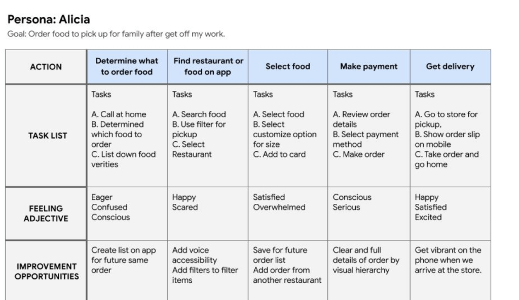
User Journey Map explored ways to improvement Opportunities.
Competitive Advantage By studying and dissecting the strategies of Uber Eats, DoorDash, and Instacart, I discerned valuable competitive advantages. This deep understanding has empowered our approach, allowing us to integrate effective tactics and refine our services to stay ahead in the market.
Competitive advantage reports explore ways to gain valuable insights for optimizing designs, differentiating the product, and staying ahead in the market.

Now, here come
the design challenges
User Journey Now that I had a better idea of what my users needed I created the sitemap with the intent of creating an experience for my users that is simple and easy to follow so that they don’t feel overwhelmed when it comes to users accessing the menu. My user flows helped me understand how I wanted each screen to be laid out in order for users to complete their tasks.
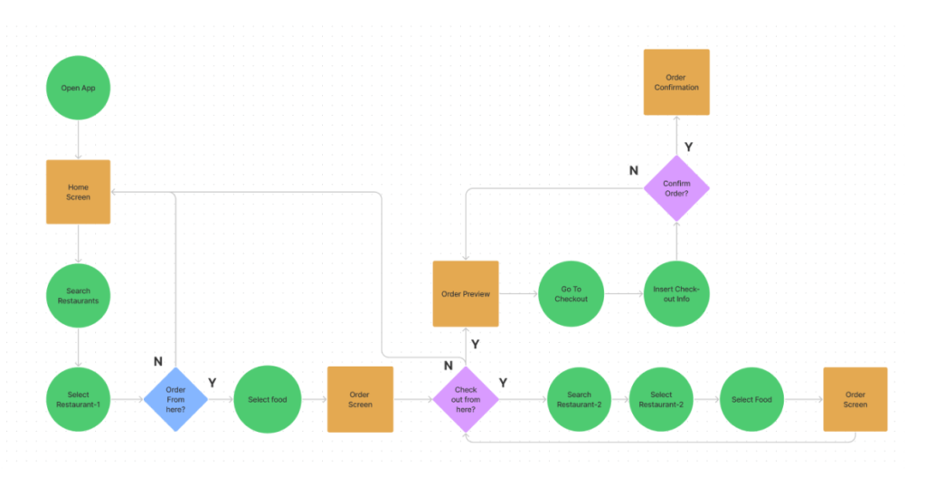
After brainstorming with stockholder and BA I designed user-flow using Figma
Initial
Design Phase
Through an interactive design process, I was quickly moving between paper and digital prototyping, testing prototypes with users, and getting feedback from my mentor and AI engineers. From each iteration, I learned something valuable. Some helped me make small usability improvements, some helped me make major changes in my design direction.
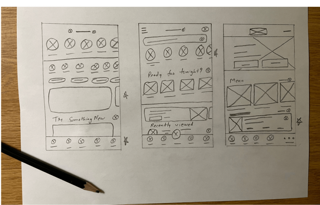
After brainstorming with stockholder and BA I designed Initial paper wireframe
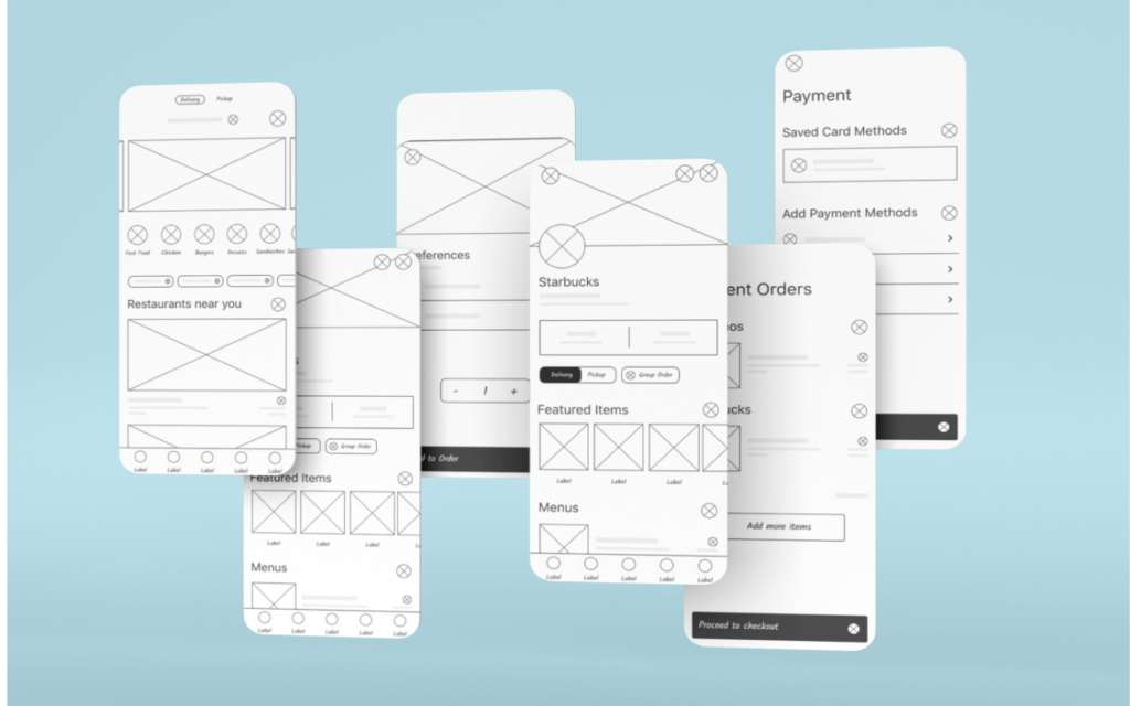
After brainstorm paper sketch I converted to digital wireframe in Figma
Mood
Board
I created a mood board in order to reflect what my brand platform conveys. The images and color represent my project’s personality and attributes.
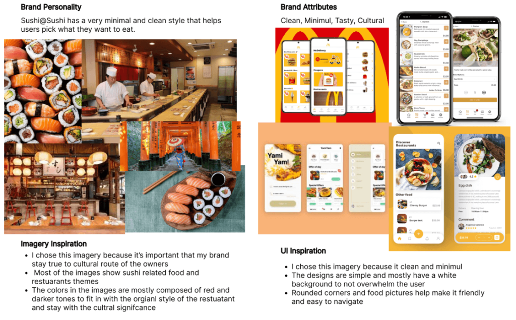
Design
System
Now that the app has a flow and structure to it, I wanted to keep the style simple and minimal while also sticking with the original color scheme.
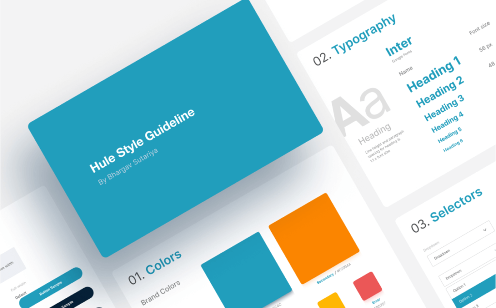
Our Style Guide Design with components, Icons, Tone, a Roadmap to Aesthetics and Consistency.
High-Fidelity UI Primed and
Ready for User Testing Adventures!
The main goal in the design process was to make a simplistic experience for users to follow and be able to make the process of ordering online efficient and quick. I made a few changes along the way allowing me to make better use of space and reconstruct certain aspects of the app that I wasn’t fond off.
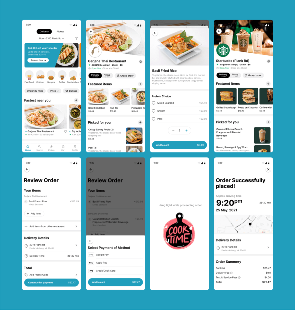
After created high fidelity UI Design to ensure visual hierarchy and consistency which align guideline of App
User Testing I created prototype from UI screens and I’ve conducted five user testing sessions from the activity organizer’s perspective as well as tree testing to ensure that the information architecture of the ordering process made sense.
Second-round iterations
to improve efficiency of use
With user testing I was able to learn what I needed to work on when it came to redesigning my work. I needed to make my product more accessible for people who have visual impairments, so what I ended up doing was enlarging the pictures and increasing the font sizes for the wording. Along with that I had to fix some spacing issues with the change.
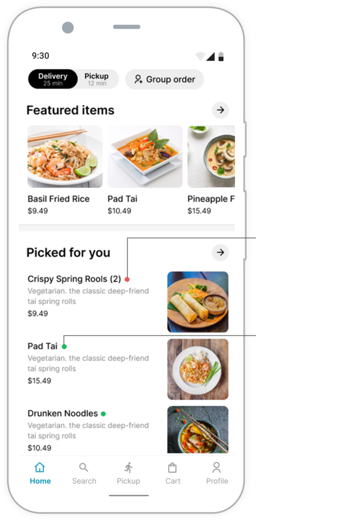
Change #1
User wants to know
veg or non-veg item
From user testing notes, user was confused to determined veg or non-veg items while selecting item. Most of the users would like to know the veg or non-veg type in each food item. So, I have updated each item with color dote. Red dote for non-veg and green dote for veg items to identify the type of preference.
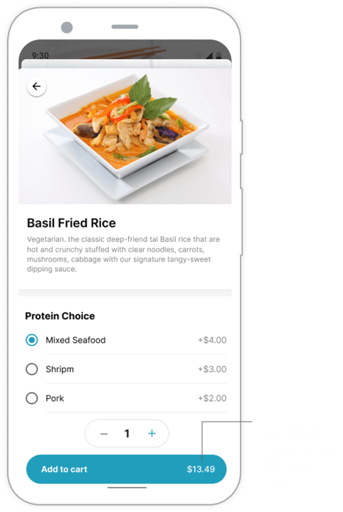
Change #2
Users wants to see
the total price while add-on ingredients
From user testing notes, most of the users would like to know the total price when they add on ingredients. So, I have shown the price on add to cart button so, the user will know the total price when he/she is adding to the cart for an order.

