Welldyne
About Project
As the Senior product designer, I solved the key usability issues and revamped the visual style by re-imagining what it’s like for WellDyne's users to manage member account. The new design reduced task times by 68% and improved users’ subjective satisfaction by 139%.
Duration
10 Sprints
My Role
UX Designer
Tools Used
Figma, Zeplin, illustrator, Photoshop
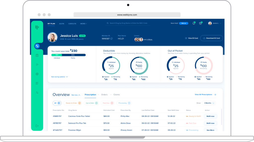
WellDyne
As the Senior product designer, I solved the key usability issues and revamped the visual style by re-imagining what it’s like for WellDyne’s users to manage member account. The new design reduced task times by 68% and improved users’ subjective satisfaction by 139%.
Duration
10 Sprints
My Role
UX Designer
Tools Used
Figma, Zeplin, illustrator,
Photoshop
WellDyne
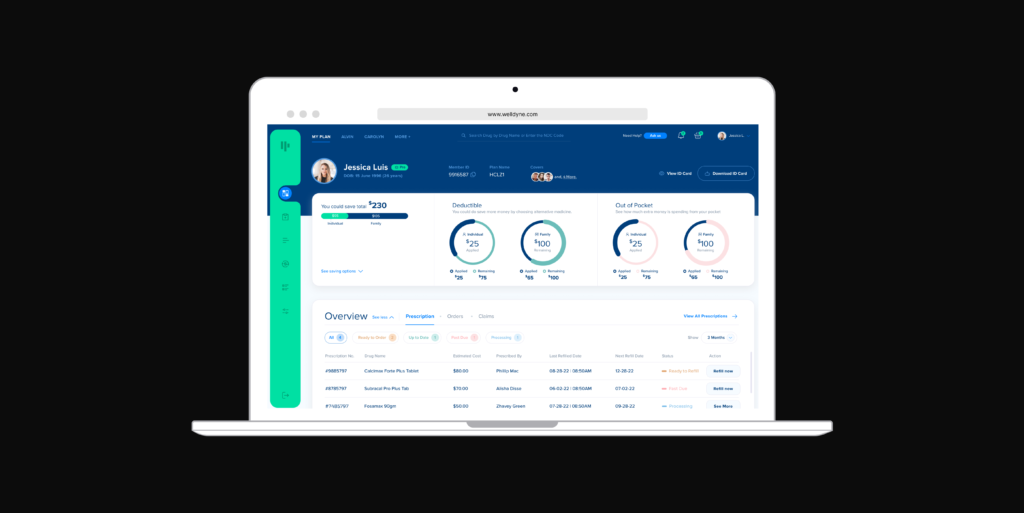
About Project
As the Senior product designer, I solved the key usability issues and revamped the visual style by re-imagining what it’s like for WellDyne’s users to manage member account. The new design reduced task times by 68% and improved users’ subjective satisfaction by 139%.
Duration
10 Sprints
My Role
UX Designer
Tools Used
Figma, Zeplin, illustrator,
Photoshop
Background WellDyne platform helps call support team to build member account management experiences for their health care products with our comprehensive AI technology. Our competitive advantage over the competitors such as Smithrx and Optumrx is the ability to empower users to talk in an unconstrained way.
Problem Space Due to time constraints, our engineers had to quickly ship MVP with the compromise of UX. However, after I did some quick usability testing, I discovered some horrendous usability issues and created two personas:
user
Problems
- Inefficiency of Use
- Users have to constantly shift between pages to search among the mixed data.
- Low Visibility of System Status
- Users mess everything up easily because they can easily lose track of each individual member information.
- Poor Mental Model of Competency
- Users have no idea what comprise a competency and what key info they need to gather.
- Fuzzy Navigation Process
- Users are struggling with what to do next and have to go extra miles to find right information.
Now, here come
the design challenges
Fast Iterations Through an interactive design process, I was quickly moving between paper and digital prototyping, testing prototypes with users, and getting feedback from Stockholder, PO, and AI engineers. From each iteration, I learned something valuable. Some helped me make small usability improvements, some helped me make major changes in my design direction.
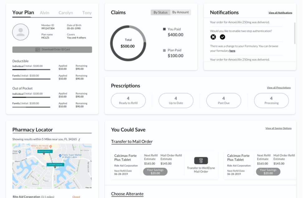
After brainstorming with stockholder and BA I designed Initial wireframe using figma
Initial iterations
to easy access Member Information
After a few brainstorming sessions, I experimented with all different ways of walking users through member information: Member general information about their membership, Member saving and how much member can save from their Drug, Deductible amount, Out of Pocket amount, navigation bar, member ID card, Prescription, Orders, Claims…
Initial prototypes explored ways to communicate to access clear membership information.
First Iteration’s Solution I settled down with creating a member page with work area because users can walk through the iterative training process without burden of switching pages. It was unclear, though, what was the best way to design the membership page.
Second-round iterations
to improve efficiency of use
As I was making progress on adding more accessible information like member orders, claims, I was also thinking about what would be an easy way for people to gather information info efficiently. This is a tricky task. I spent hours trying to figure this out:
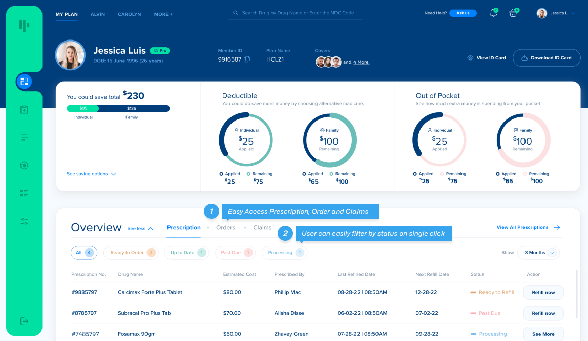
Second-round prototypes explored ways to improve efficiency of use.
Second Iteration’s Solution Then I had the outside-the-box idea of offering an member page. Users can see all the info at a glance without digging deep into the dashboard. A perfect solution!
Design
Decisions
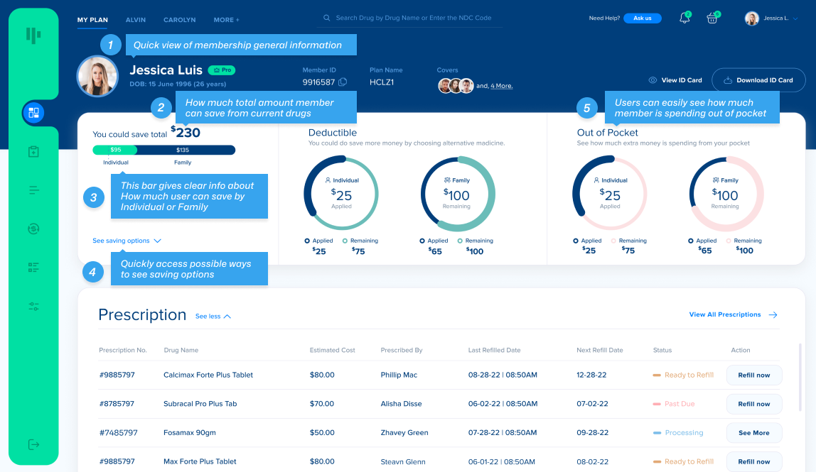
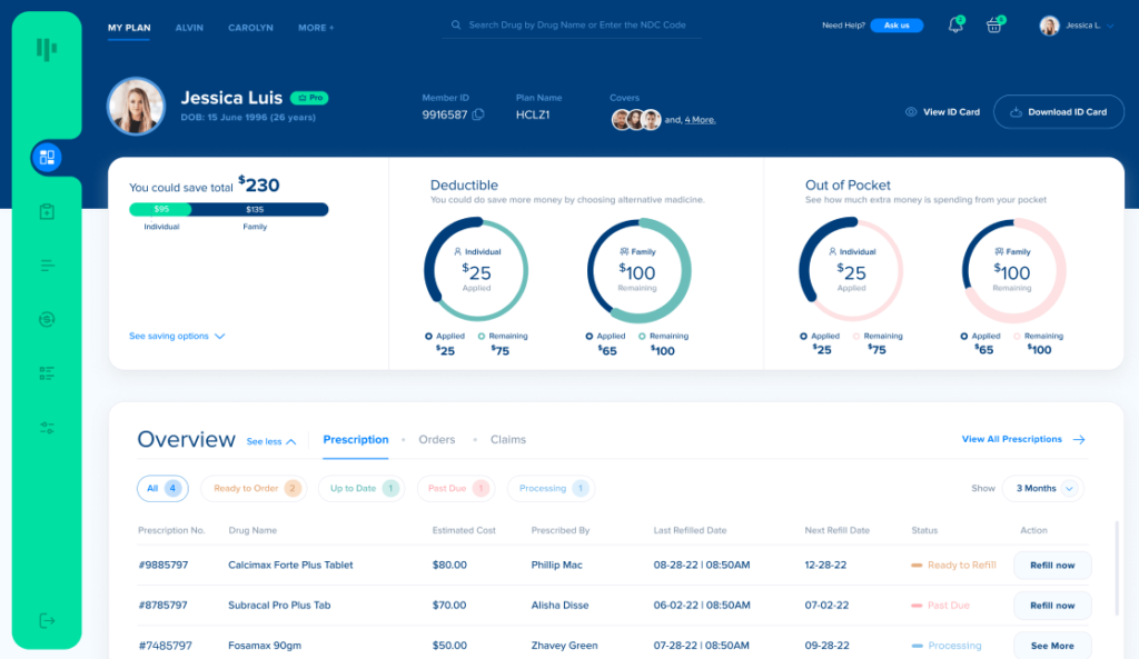
Member Page. Keep everything on track with better information architecture
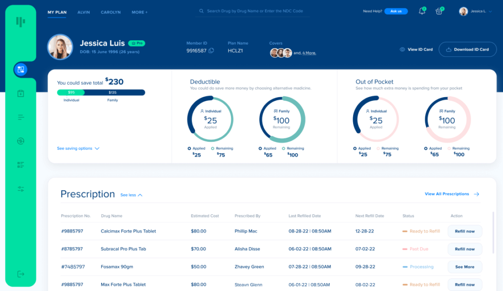
Member Page. Keep track of the training progress easily.
Benefits You will be welcomed by an member page that provides all the information of member’s overview, savings, deductible amount, out of pocket spending, prescription, orders, claim in a single page with the following benefits:
The
Solutions
- Good Mental Model of Competency
- You have a better understanding of what comprise a competency.
- High Efficiency of Use
- You can see all the member info at a glance without digging deep into the different web pages.
- High Visibility of System Status
- You can have detailed control over orders and claims. You are informed of the states of orders and claims.
- Better Information Architecture
- No matter you are a power user or non-power user, you get all the member info at hand with clear understanding.
Overview
Page.
Overview page at your fingertips without burden of switching pages
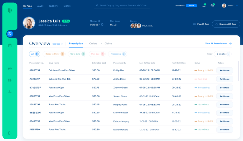
Overview section with Prescription, Orders, Claims. Users can manage member’s request at their fingertips.
Benefits If you hit the button either “Ready to order”, “Up to Date”, “Past Due”, “Processing”, you will filter respective prescription list and next to the status number can see number of presciption lists with the following benefits:
Visual
Style.
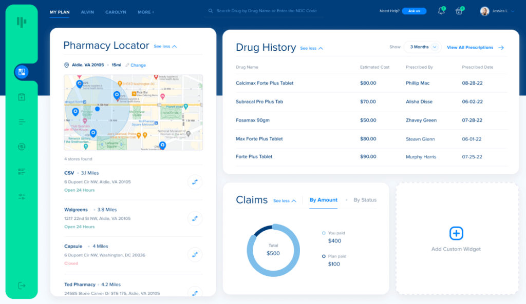
I redesigned Member, Overview, Pharmacy locator, Claim Overview, Sidebar pages for WellDyne so that it best express our brand identity. It’s innovative, imaginative, and accessible.

Navigation
Page.
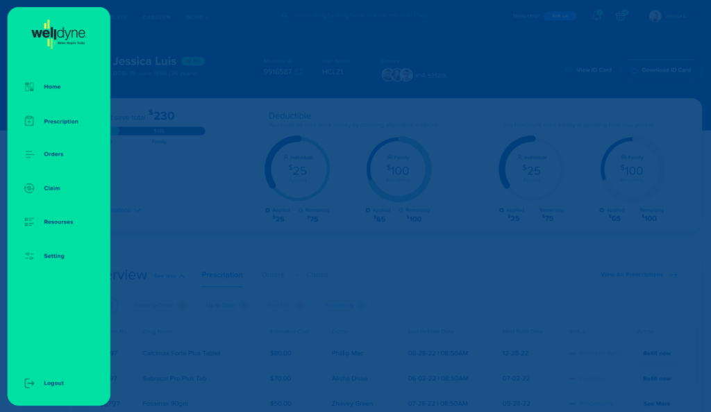
Proactively communicate our product value.
This is an important page to navigate user to most important and often use pages to provide high quality support to end-user.
The
Benefits
- Color Balance
- I added contrast W3C standard accessible color to navigation background to clearly describe what it purpose and how it differentiate from other elements. This supports focused design and customer retention.
- Focused Design
- I have added transparent blue brand color background to bring focused navigation menus.
- Custom Icons
- Custom designed icons explained purpose of action on the navigation menus.

Navigation Page. Proactively communicate the value of our technology.
Notification
Section.
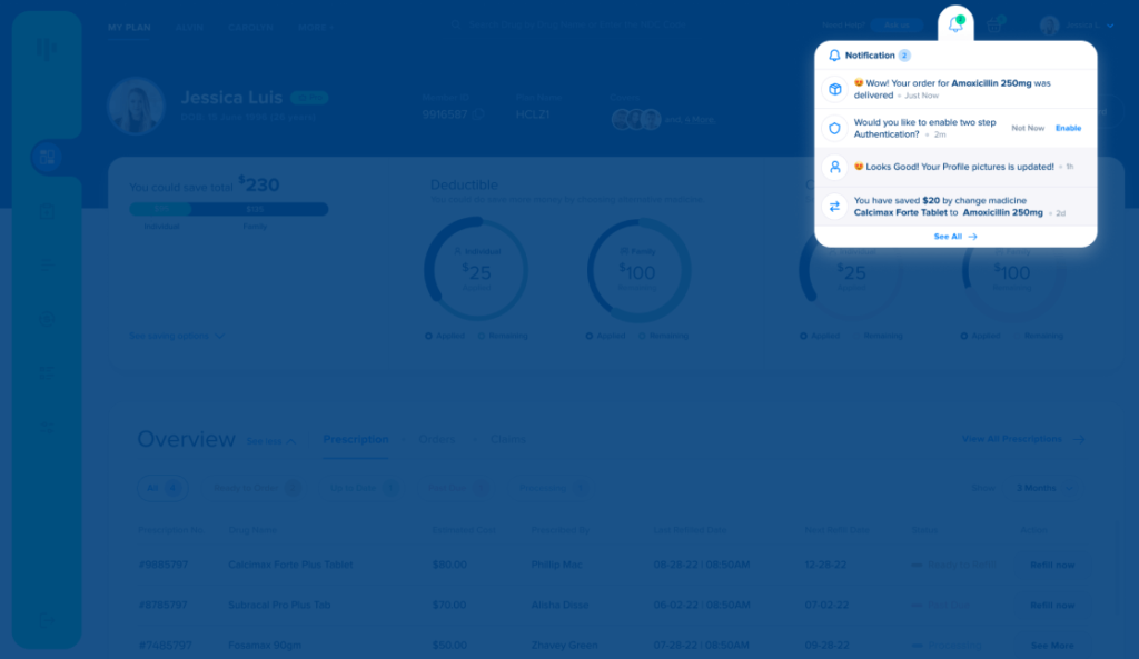
Notify all activities in simple way!
The original design discourages users to give limited updates, I have incorporated all in one notifications about orders and saving activities, not only with plain view, but visually communicative design, because it was hard for users to understand a specific notification through the entire list of notifications.
The
Benefits
- Focused Design
- I have highlighted new notification which can districted from seen notifications which supports focused design.
- Custom Icons
- Custom designed icons explained purpose of action on the navigation menus.

Notification Section. Proactively communicate the value of our technology.
